Typography 34
Type Directors Club
book reviews:
· general fiction
· chick lit/romance
· sci-fi/fantasy
· graphic novels
· nonfiction
· audio books
· author interviews
· children's books @
curledupkids.com
· DVD reviews @
curledupdvd.com
newsletter
win books
buy online
links
home
for authors
& publishers
for reviewers
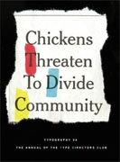 |
Typography 34 Type Directors Club Harper Design Hardcover 304 pages March 2014 |
|
The most recent publication of the Type Directors Club is the result of over 2,300 submissions from around the world. The compositions cover a wide range of categories: books, magazines, corporate logos, letterheads, posters, video and web graphics, etc. Some of the choices for publication are familiar, some more obscure, some deceptively simple, others elaborate, but all showcase “incredible innovation alongside classical beauty, sumptuous print design alongside digital interaction, established professionals alongside promising students.”
The panel of judges examined submissions for thirty-three countries. In the end, only fourteen typefaces were chosen for the annual. One section of the publication introduces the judges, followed by their particular choices. The designer’s statement and the judge’s statement add particular insight into the reasoning behind the selection process and the exhaustive procedures that led to the final choices for inclusion in the annual. This beautifully bound oversized book is a treasure for those who love typeface design, but “the real stars of the show are the talented designers whose work was chosen to appear.” Paging through the entries is visually stimulating, an intimate tour of the varieties of creativity in many forms, the ingenuity of perspectives, the humor and whimsy that surfaces yet maintains function in the everyday. An infinite variety of typefaces create mood, entertaining while informing, drawing the eye to the harmony of design that surrounds us, artists unable to resist the allure of design, leaving their mark that others might absorb and take notice. A striking and well-thought out layout encourages an exciting journey through the changing world of typeface in 2013. Originally published on Curled Up With A Good Book at www.curledup.com. © Luan Gaines, 2014 |
 Items chosen for the publication include German holiday cookie tins and product labels, movie credits, calendars, menus, corporate publications, all the things that define our everyday surroundings. The scope of the submissions is impressive, the energy and creativity invested in objects that catch the eye and hold our attention, from logos to packaging, video captures and innovative typefaces suited to a contemporary environment yet grounded in the basic tenets of good design.
|
|
|
 Click here to learn more about this month's sponsor! |
|
| fiction · sf/f · comic books · nonfiction · audio newsletter · free book contest · buy books online review index · links · · authors & publishers reviewers |
|
| site by ELBO Computing Resources, Inc. | |
